Case study · Web
This website
My own portfolio: a website that gives video and web design equal weight — fast, accessible and in three languages.
- Client
- Personal project
- Role
- Design · Development · SEO
- Software
- Astro · TypeScript · CSS
- Year
- 2026
What they needed, what I did and how it turned out
The brief
I needed a website that shows the two things I do, video editing and web design, without one overshadowing the other. It had to load fast on mobile, read well in English, Spanish and Catalan, and be ready to show up on Google from day one.
What I did
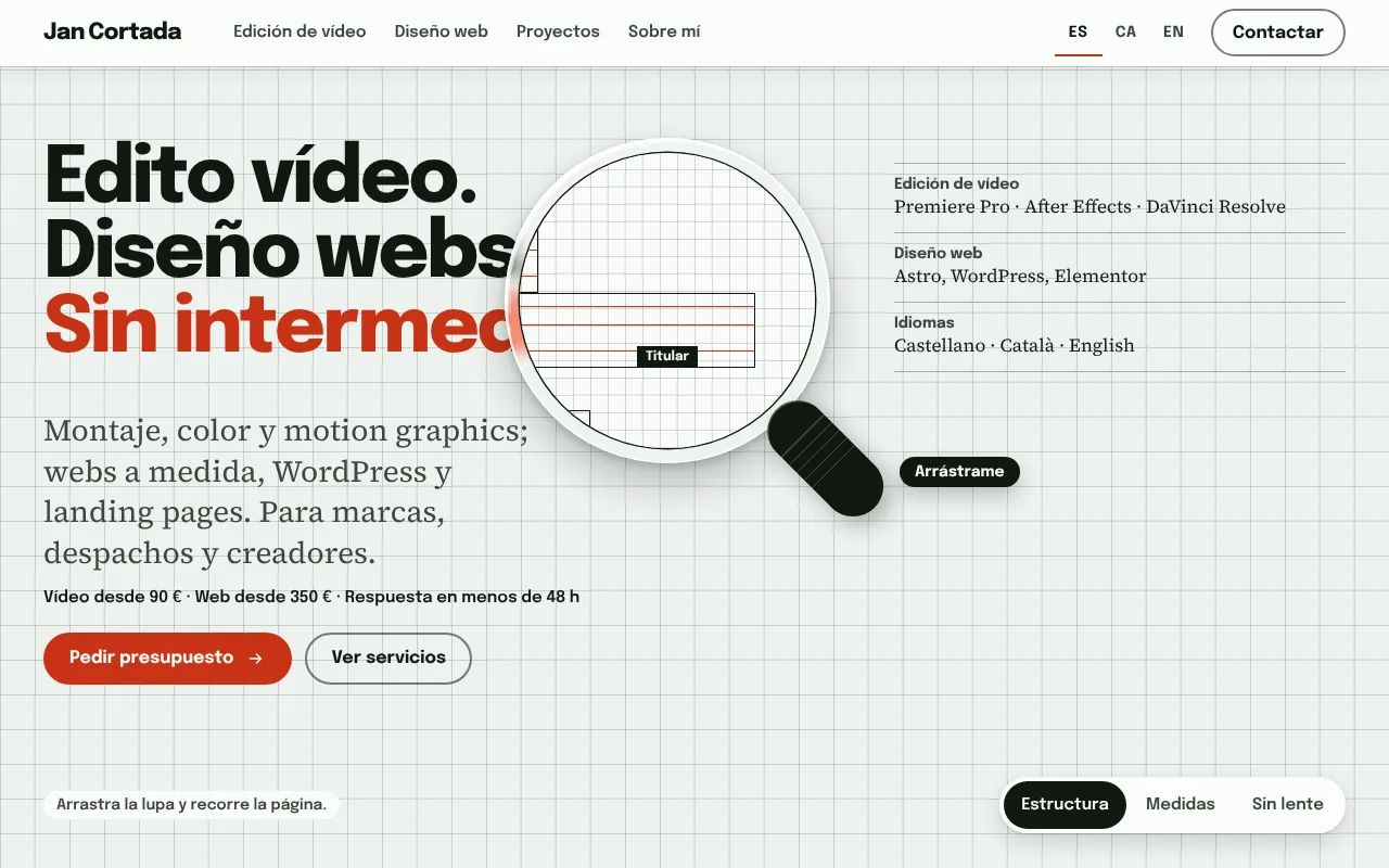
- Concept: drafting paper with a grid, ink and a single colour. Video and web share the same space and components, and a magnifier you can drag shows the page’s own insides: its structure and its real measurements. To ask for a quote there is an order builder: you pick the services, see the “from” total and the email comes already written. Every part of the interface does a real job: if something looks like a button, it works.
- Development: Astro with static output and no UI frameworks. All the text is in the HTML and the JavaScript is minimal and progressive: the site works without it.
- Three languages: a route per language,
hreflangtags and copy kept separate from the design. - Technical SEO: meta tags, structured data (JSON-LD), a sitemap and canonical URLs.
- Performance: self-hosted variable fonts with only the Latin characters, optimised images and videos that only load when you press play.
The result
A light, accessible website that can grow with new projects by writing one text file per case study.
The previous version
There was another site before this one, the Edit suite: a site that worked like a video editing program. It’s still online, archived.
How I got here
Before settling on this design I tried three ideas, each on its own test page. All three used the same copy and prices; what changed was the look and what you could do with your hands.
Grade
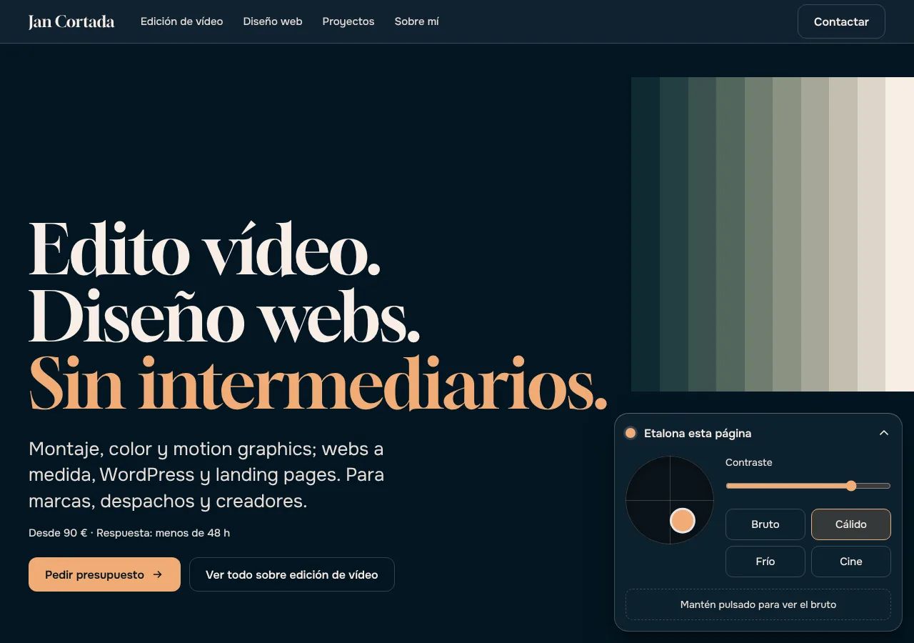
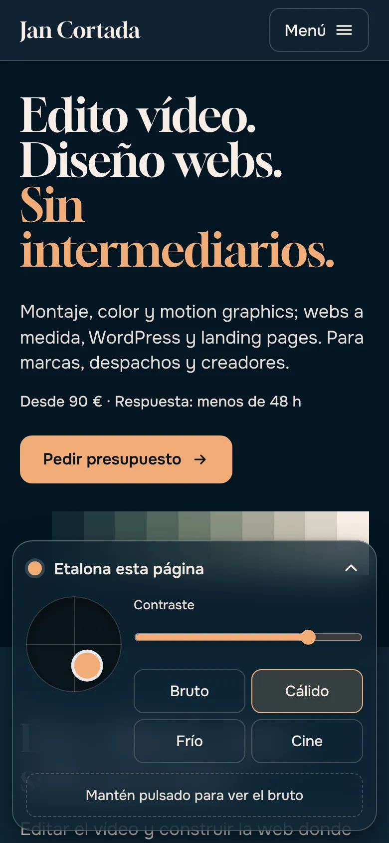
The page arrived ungraded and you graded it yourself: one dot for hue and intensity, a contrast control and four looks. Every colour on the site responded at once, so colour was shown rather than claimed. I liked it, but it proves my colour judgement with a website, not with video. I'm keeping it for video footage, which is where it makes sense.
Cut
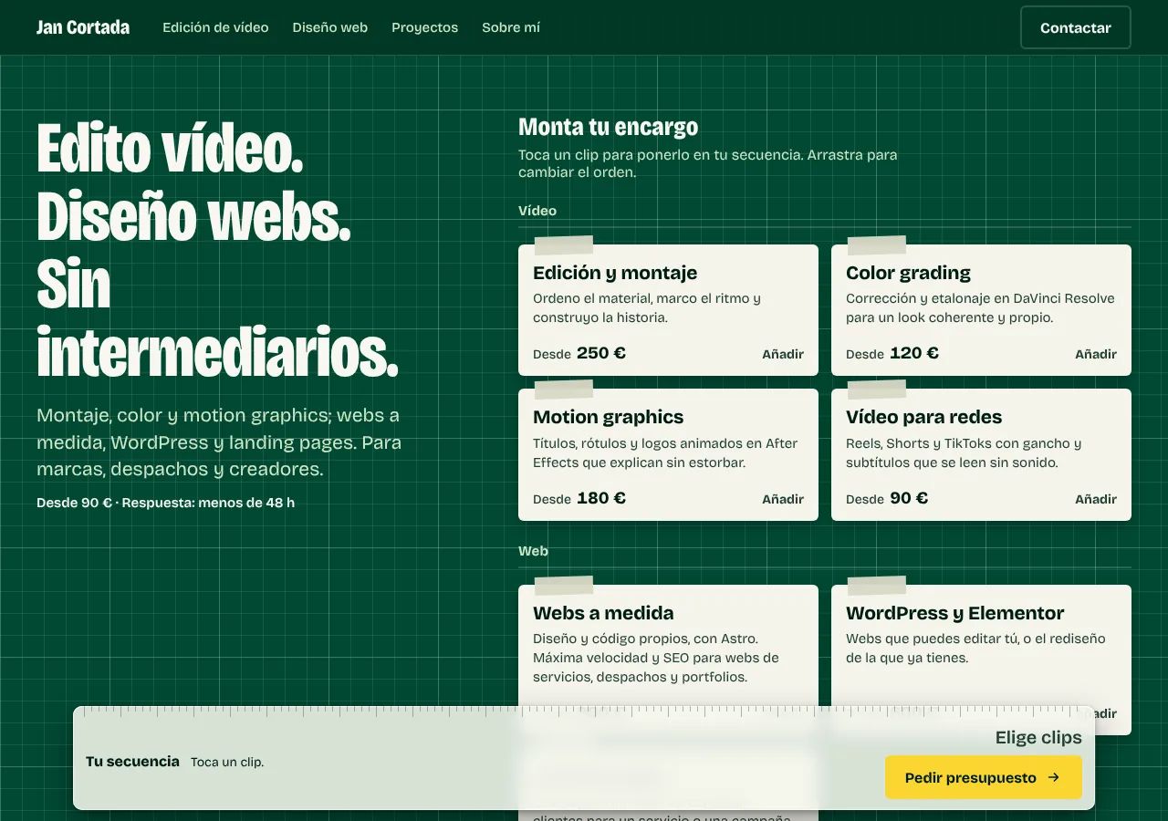
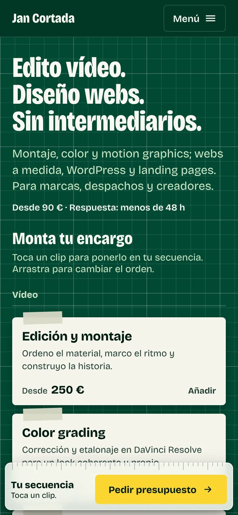
You built your brief from clips: tap the services, arrange them on a ruler, and the button opened an email with your selection and the total already written. It was the most practical for someone asking for a quote, but the site stayed a form: it didn't show how I work.
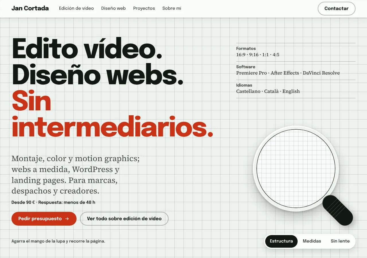
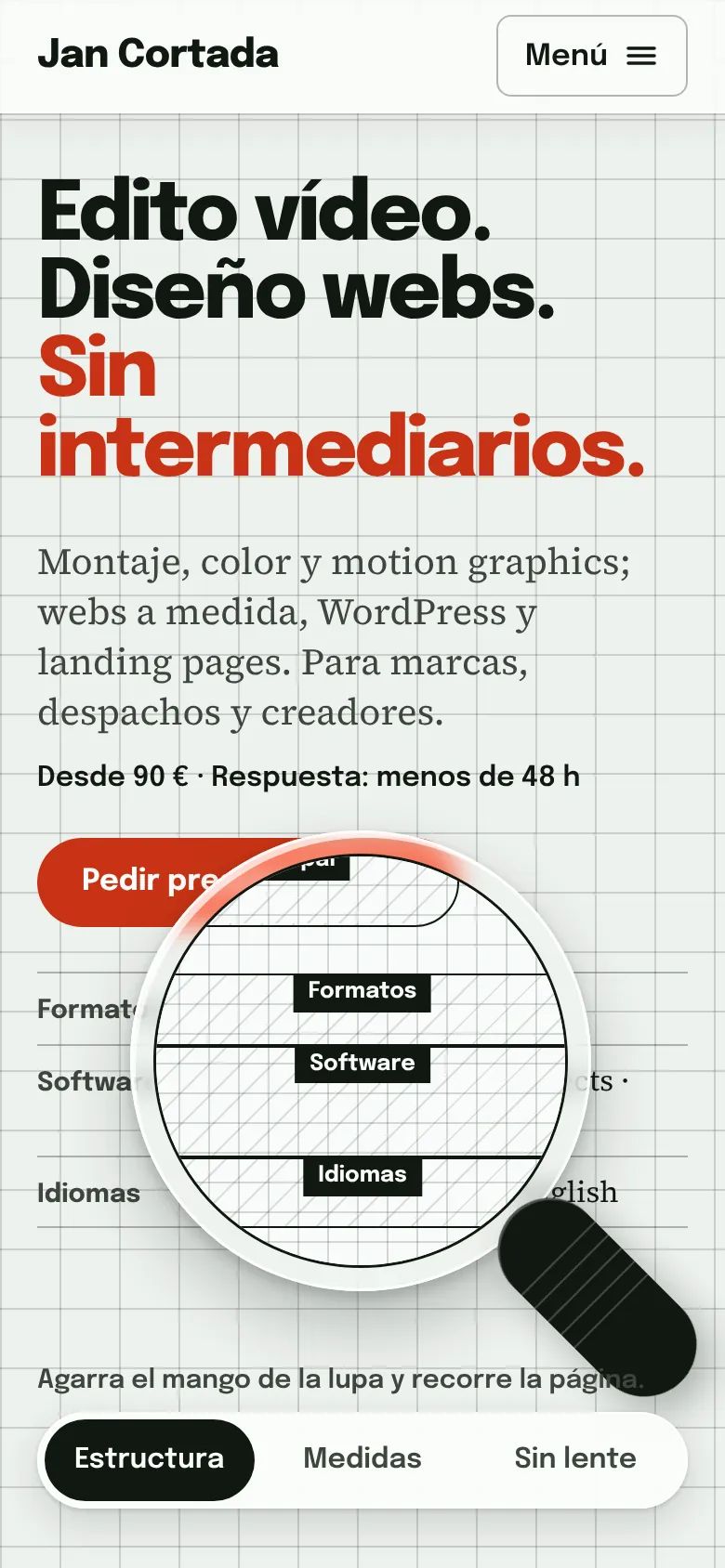
LensThe one I chose
A glass magnifier you drag to see the page from the inside: its structure and its real measurements, read from the site at that moment. I chose it because it shows, without saying so, that I do both things: I edit video and I build websites. The site is the proof.
From the Cut I took the brief builder: you pick the services, see the "from" total and the email comes already written. It sits at the end of every page.
Need a websitepeople can find?
Tell me about your project and I'll reply within 48 h with a proposal and a fixed price.
Build your brief
Your brief
Pick what you need, or just write to me directly.
Total from —