Case study · Web
Edit suite
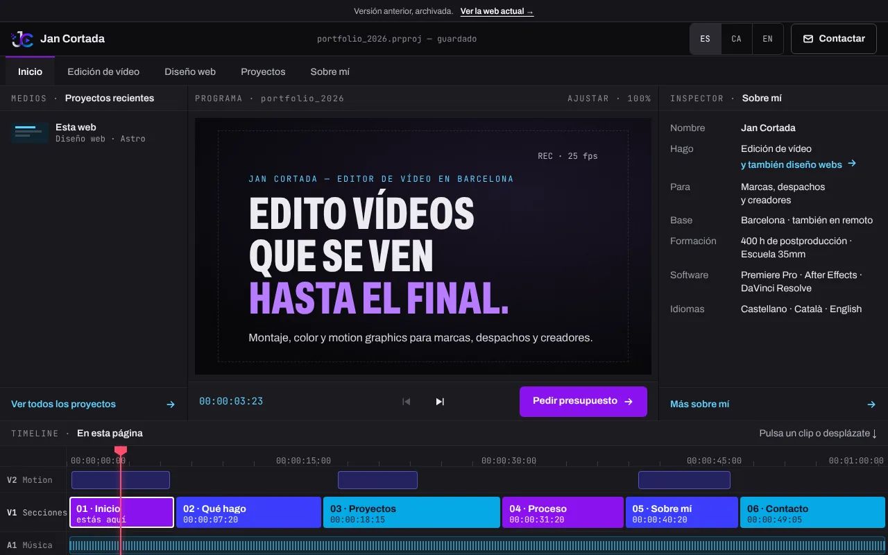
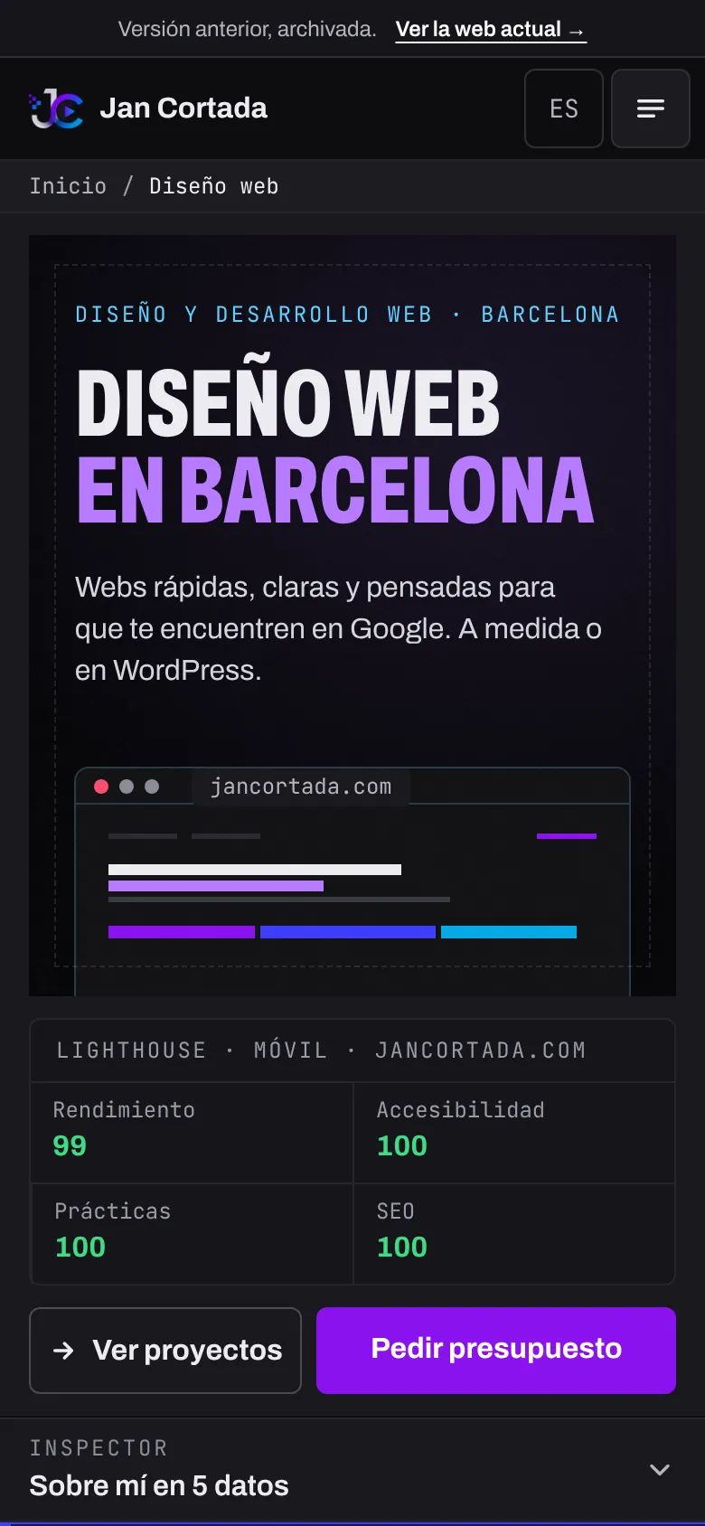
The previous version of my site: a page that worked like a video editing program. It's still online, archived.
- Client
- Personal project
- Role
- Design · Development
- Software
- Astro · TypeScript · CSS
- Year
- 2026
What they needed, what I did and how it turned out
What I was after
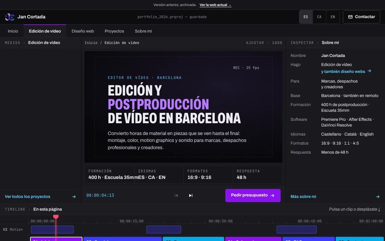
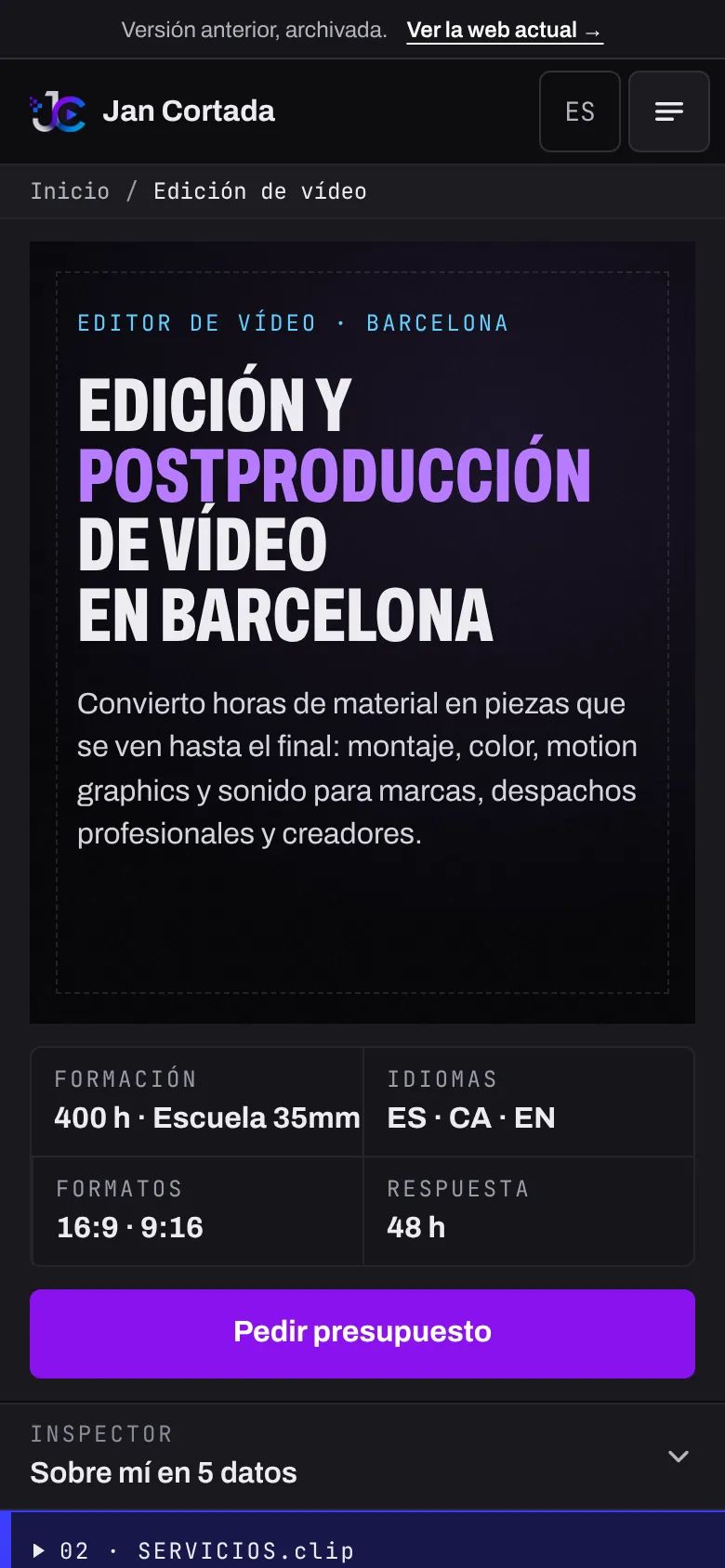
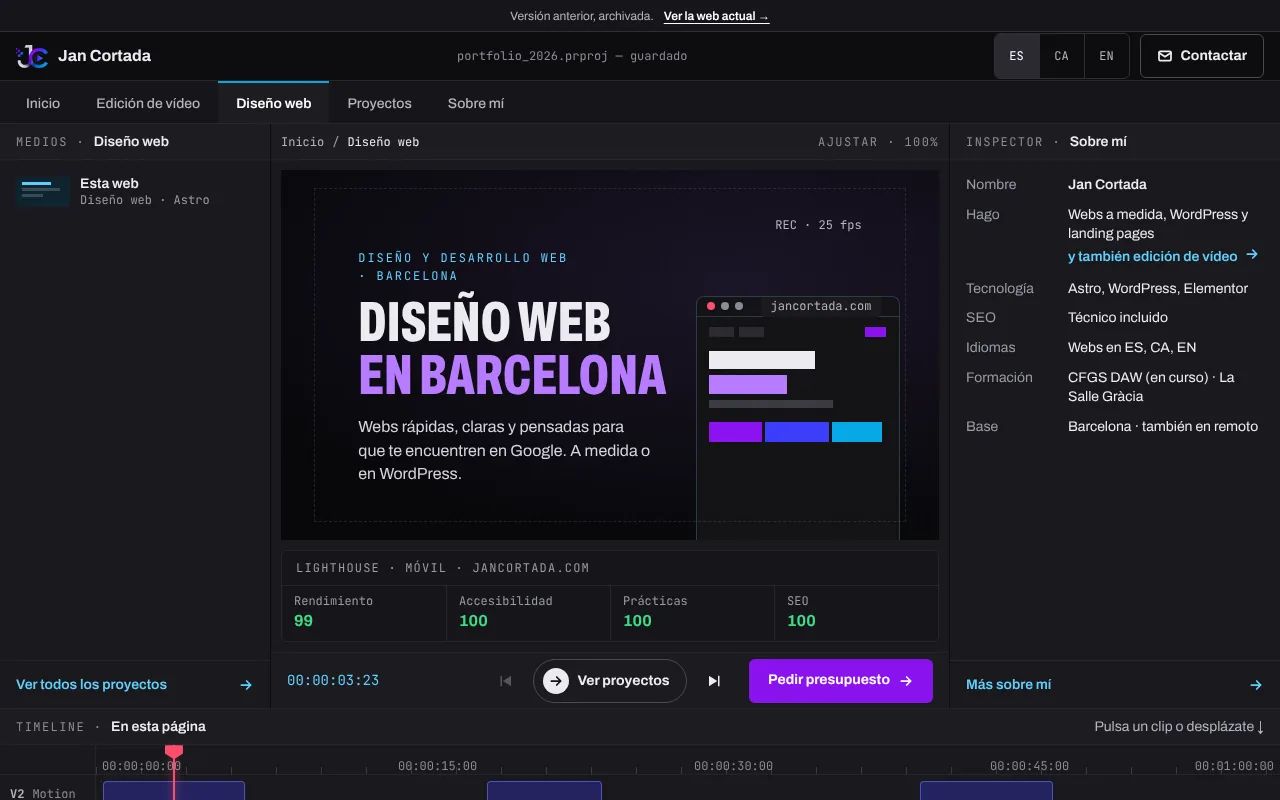
I wanted anyone landing on my site to understand straight away that I edit video. So I built it like an editing program: tabs were the pages, a timeline ran through the sections, a media panel held the projects and the home page was a viewer with its own transport controls. Dark theme, a single purple primary button, condensed headlines and a monospaced typeface for the labels.
Why I changed it
Over time I saw three problems.
- It looked like a control and wasn’t. Rulers, tracks, a “REC” label: decoration that imitated buttons and did nothing. If you don’t use editing software, it’s just jargon.
- Prices and contact were far away. You had to scroll a long way to reach what matters most to someone asking for a quote.
- Video took over the home page. Web design, the other half of what I do, came across as an extra.
What I kept
From the Edit suite I keep public prices and turnaround times, and one rule: if something looks like a button, it works (though I didn’t always stick to it there). The current site starts from there.
How it is now
I’ve left it archived as it was: it’s not indexed by search engines and the bar at the top links to the current site. So do its contact buttons, because that version’s prices are out of date.
Screenshots
Need a websitepeople can find?
Tell me about your project and I'll reply within 48 h with a proposal and a fixed price.
Build your brief
Your brief
Pick what you need, or just write to me directly.
Total from —